Saturday, April 30, 2016

One-Layer Simplicity #27: Fruit Smoothie

The May One-Layer Simplicity Challenge is hosted by Heather Telford, and her theme is "Fruit Smoothie"! Make a card that features fruit or that uses inks with fruit-themed names.

How much fun is this!??!!!

My card fills a hard-to-fill need in my cardmaking: a birthday card for my father-in-law. He loves wine, so a grape-themed card works perfectly!


The grapes and vine are from Papertrey's Fruitful set, and the sentiment is from one of their sentiment sets (not sure of the name). The inks are from Kaleidacolor's Vineyard pad...the dark purple and the lighter green. Since all the stamps were fairly narrow, I could ink them on the Vineyard pad.
I also stamped an envelope. Clean-and-simple is all in the details.


Click on over to the One-Layer Simplicity Challenge and play along with Heather's fun Fruit Smoothie challenge!

Supplies
stamps: Papertrey
ink: Kaleidacolor
paper: Papertrey white
accessories: corner rounder

Thursday, April 28, 2016

How to Make a Sixteenth-Inch Mat

There've been lots of questions via email and comments about how to make a tidy 1/16" mat, so here's a visual guide of how I do it.

Supplies: panel to be matted, card stock for the mat, quilting ruler,
self-healing cutting mat, craft knife with sharp blade

WARNING: Precise cutting with a regular paper trimmer is great...as long as your trimmer is perfectly angled and marked. If it's even slightly off, things will never line up right. I prefer the control of using a quilting ruler and craft knife. If you've never used these tools before, BE CAREFUL. It's easy to slice your fingers, so always make sure they are firmly on the quilting ruler and not hanging over the edge as you cut. You have been warned!

Measure the panel you want to mat. As you can see, this panel
is exactly 3 inches by 1.75 inches.

Position the cardstock for the mat under the ruler at precisely
1/8" larger than the panel you want to mat. Use the grid lines
on the ruler to make sure everything is at right angles.

Cut the mat using the craft knife. Since I'm right-handed, the blade is in my
right hand, and all the fingers of my left hand are on the ruler
pressing down firmly to keep it from sliding around on the paper.

Check to make sure everything lines up BEFORE gluing the panel
to the mat. Sometimes, as careful and experienced as I am at this,
I mis-measure and have to re-cut. 

Here's the finished card. Yay!

To make the stamped panel, I punched the heart out of a post-it note and angled it onto my panel. After sponging Brilliance poppy ink through the mask, I removed the post-it and stamped the sentiment in Memento Luxe black. I love how the heart looks velvet-textured, almost like it's been flocked. But it's just ink.

Hopefully, the pictures clarify the process, but if anyone still has questions, please ask in the comments, and I'll do my best to answer!

Supplies
stamps: Concord & 9th Map Love
ink: Brilliance poppy, Memento Luxe black
paper: StampinUp black, Papertrey white
accessories: post-its, heart punch (EK Success), sponge


Wednesday, April 27, 2016

More Business Inspiration

Today's "business card" design wasn't inspired by a specific pin (at least, not one that I can find), but it's clearly influenced by all my business cards I've been soaking up on Pinterest. (Surely there is one with a pastel background and bold, black name on it somewhere!)

The idea popped into my head as I rifled through a stack of stamps and saw the map of the world and the large-ish sentiment in Concord & 9th's Map Love set.

A card was born.


The black and Memento pear tart are such a striking, dramatic color combination.  This will be going into my hub's lunch box on Friday. Just because.

Supplies
stamps: Concord & 9th Map Love
ink: Memento pear tart, Memento Luxe black
paper: Papertrey white, StampinUp black
accessories: none

Tuesday, April 26, 2016

Colored Cardstock! And a Question

Okay, so it's just a little bit of a mat of colored cardstock, but still. I want full credit!


Today's card was inspired by THIS BUSINESS CARD on my Pure Inspiration Board on Pinterest. The interpretation, as with yesterday's card, is rather literal. I love that there's plenty of strong color, but also plenty of fresh white space, too, both on the card base and within the stamped panel as well.

The thin mat is only 1/16" but it gives a great frame of color. A wider mat would overwhelm the card, I think.

The colored cardstock is Papertrey's terracotta tile, which seems to be a perfect match for the Ancient Page henna ink (the darker red on the stamped panel). My henna ink pad is drying out after 13 years (so no complaints there!) but I can't find a replacement or a reinker for it anywhere. So here's the question:

Have you used the Papertrey terracotta tile ink? Is it a nice dye ink? Does it stamp well? Does it match the terracotta tile paper?

Thanks in advance for your help!

Supplies
stamps: Hero Arts Spring Hello by Lia, Papertrey Faux Ribbon (sentiment), Simon Says Envelope Sentiments
ink: Ancient Page henna; Hero Arts dark quartz, moss; Memento Luxe espresso truffle
paper: Papertrey white, terracotta tile
accessories: envelope

Monday, April 25, 2016

Bonkers for Business Cards

I spent a very fruitful few hours today being inspired by business cards on Pinterest. Oh. My. Goodness. You'll be seeing these fruits of my labors over the next few days. Later this week, I'll post about organization and such, and will share some fabulous ideas y'all have for that irksome subject.

But to today's business-card inspired greeting card. Check out the FOUR layers of cardstock here. The only way I can do this is to use white, you know. It's a rule. 


My thank-you card was inspired by THIS PIN. As you can see, it's a pretty literal interpretation. Aside from the layout (which is grand), the color combo on the original struck me as so very pretty I just had to try it.

The simplicity of the "business card" looked sadly blah on a plain card base, hence the layers of mats. Nothing is popped up with craft foam, so the card is nice and flat and easy to mail.

Be sure to check out tomorrow's card...it has colored card stock on it. How SHOCKING!

*giggle*

Supplies
stamps: Mama Elephant (Freestyle Florals), Gina K (sentiment)
ink: Brilliance pearlescent olive, Memento Luxe espresso truffle
paper: Papertrey white
accessories: none 


Sunday, April 24, 2016

More Art

Playing around with the Jumbo Abstract Art set from My Favorite things...lots of fun!


The card and envelope combo repeats a color combination from an Inspiration Challenge post I did a few weeks ago, but using a couple of new ink pads: Hero Arts hybrid tangerine and mulled wine.

I haven't conditioned these stamps yet, but the blotchiness of the ink works with the whole concept, so I'm not fussed. The inks are really lovely, rich colors.


The sentiment comes from a Hero Arts set called Create by Lia. The lines on the envelope are from Simon Says Stamp's Envelope Sentiments.


Yesterday's card is going to my mother, but today's will go to one of my Stephen Ministry friends who is also a counselor and art therapist.

My son Nick just wrapped up his role as The Cop in the high school musical Footloose. He's the guy in the middle with the striped shirt, sitting next to the lead, whom he chews out a few scenes later. So proud of my son and all the cast, crew, and musicians. It's amazing what a whole bunch of high school students, parent volunteers, musicians, and teachers can accomplish. Everybody cut footloose!


Supplies
stamps: MFT, Hero Arts, Simon Says
ink: Hero Arts, Memento Luxe black
paper: Papertrey white
accessories: envelope, corner rounder

Saturday, April 23, 2016

Art

Everyday life, with its abundance of humdrum chores and mindless routine, can accumulate a great deal of dust. Creative outlets wash away that dust, give us fresh air to breath, energy to learn and grow and thrive. 


With a coordinating envelope, this card will be an extra-special piece of mail that is "definitely not junk mail."

The card was made with a Kaleidacolor ink pad and the long stamp from Jumbo Abstract Art by My Favorite Things. The inked stamp received a heavy several spritzes from Tattered Angels Dazzling Diamonds spray for a bit of shimmer and watercolor-y blending. The sentiment stands out in Memento Luxe tuxedo black.


I love how the aquatic colors of the Kaleidacolor and the subtle shimmer add to the idea of washing away dust.


I'm trying to do more "follow-through" with envelopes and such, so I stamped the flap of the envelope with a couple of much smaller stamps from the Jumbo Abstract Art set.  They are also shimmery from the Dazzling Diamonds. Love it!


Thanks for the input on my last post. Y'all have given me some great ideas for organizing and thoughts regarding whether to create an index or not. Updates to follow. 

Supplies
stamps: My Favorite Things Jumbo Abstract Art, Inkadinkado Picasso sentiment, Simon Says Stamp Envelope Sentiments
ink: Kaleidacolor, Memento Luxe
paper: Papertrey
accessories: Dazzling Diamonds glimmer mist, envelope

Friday, April 22, 2016

Another Business Card Inspiration and Organization Questions

The business card search on Pinterest yielded a LOT of inspiration and will no doubt crop up repeatedly over the next few months as I've pinned a bunch of pictures on my Pure Inspiration Board. So much goodness!

Anyway, several different business cards used this basic idea of a rectangle divided into two triangles, but this one was the primary inspiration, and the influence is very plain to see in my versions in both the layout and the font choice.


My preference is for the blue version (Hero Arts soft pool ink) rather than the pink (Hero Arts soft blossom), which came out a bit too dark, I think, and therefore not so "happy." You are, of course, free to prefer the pink, or to hate them both, or to think they are both meh. Isn't life grand?

My craft-room clean-up is going well, but I'm struggling with several first-world issues that cause me to purse my lips in Church-Lady style and mutter, "Well, isn't that special." Your thoughts and suggestions would be appreciated. I simply MUST get that look off my face!

1. Organizing Sentiment Sets: I've accumulated a frightful number of sentiment sets, and yes, I often still lack just the sentiment I want. Not sure how or why that might be, but there it is. Anyway, shuffling through all of them, even when I know what I'm looking for, is cumbersome. Some of the sets are in CD cases and some are in transparency folders. All are stored in a CD storage case that is almost full. I'm considering purging a few of the sets and adding dividers to the storage case so, say, all the Birthday sets are together, all the thanks sets, all the sympathy/get well/encouragement sets, and so on. This will still leave the bulk in a multiple occassions group but will at least add some order to the confusion. Has anyone ever tried this? Does anyone have any better ideas?

2. To index, or not to index? My stamp index is a mess. Is it worth it to spend the time completely redoing it? Understand it will take a REALLY long time to recreate...and it will be the sixth or seventh time I've done it in 13 years. Last time, I had wrist problems for weeks as I worked on it. BUT if I worked through slowly, like the Little Engine Who Could, it might be nice to have. Do you have an index? Do you bother to keep it updated? Do you use it enough to justify having created it? Am I completely insane for fretting about this? Should I just let it go? Aaaarrrrggghhh!!!!!

Thank you in advance for your input.

Supplies
stamps: Clear and Simple (discontinued thinking of you set)
paper: Papertrey White, StampinUp black
ink: Hero Arts soft pool, soft blossom, intense black
accessories: Post-its for masking

Thursday, April 21, 2016

Resistance Isn't Futile

But it is pretty.


Resist techniques can be so much fun, especially when they are as easy as this one. Clear embossing powder for the sentiment, over-stamped with Memento inks, and a few rhinestones for interest. Piece of cake.

Resistance is, however, futile when it comes to my periodic obsession with reorganizing my craft space. In fact, I feel a massive re-org coming on.

Sometimes obsessions are your friends. Sometimes they aren't.

It remains to be seen which outcome we'll have have this time. Either way, maybe there will be pictures. And perhaps grab boxes to sell.

Spring Cleaning on Steroids. Oh. My.

What are your favorite tips for purging, cleaning, organizing, storing, and otherwise managing your craft stash? Please share!


Supplies
stamps: Papertrey
ink: Memento, clear embossing ink
paper: Papertrey
accessories: clear embossing powder, heat gun, rhinestones


Wednesday, April 20, 2016

Powerful Color

Not much time tonight, so here's a quick post for a quick, bold card. When a stamp is well-designed and fun, all you need is great color...in this case, from a Desert Heat Kaleidacolor spectrum pad.


Hope you're enjoying sunshine where you are. Ohio has had lovely weather for days and days! It'll end, but oh, my, how grateful I am it has been!!!

Supplies
stamps: CAS-ual Friday Sunbeams
ink: Kaleidacolor desert heat, Memento Luxe espresso truffle
paper: papertrey white
accessories: craft foam, glue

Tuesday, April 19, 2016

Play, Play, Play Like Your Life Depends on It


Trigger Warning: We are all adults here, but this post might be offensive if you're sensitive about foreskins in the Biblical sense. You have been warned. And no, I haven't been drinking (well, just a tiny glass of Apothic Dark), but I have been feeling very, very playful and giggly all day.

So, as I was sitting in Bible study this morning, switching between two different study books, neither of which will stay open by itself, it occurred to me that bookmarks might be helpful. So when an hour of fun time presented itself this afternoon, I decided to make a few bookmarks and challenged myself to make them in completely different styles.


I'd say these represent four very different styles, although upon reflection, none of them is suitable for my Bible study books. We're studying Paul's letter to the Galatians. To circumcise or not to circumcise? That is the question.

It's unlikely Hamlet was circumcised, but Paul's point is that Jesus doesn't care about your foreskin.

As very few of you ever had a foreskin to remove or not remove, let's shuffle back to the subject of bookmarks.

First up, I call this one Bookish Elegance. It's made with classic colors, an elegant flourish, and a quotation from C.S. Lewis (about whose state of circumcision I know nothing). No tassel or ribbon, though, which is fine. I'll put this one in The Poisonwood Bible when I start it in a week or two. That's a fairly big book. Plus, Barbara Kingsolver writes elegant prose.


Second, let's call this one Happy Soul. This is a bright, colorful, fun book mark with a button sewn onto the ribbon for true ease in finding your spot. This might be suitable for Chet and Bernie mysteries (narrated by a dog) or, even better, The No. One Ladies Detective Agency. Or the Mitford series. Those are books to make a soul happy.


Third, (my favorite) The Flutter-By. This bookmark plays up the sweet outline butterflies with Impress Fresh Ink's celery and pool. And tiny, non-book-damaging bling. This is for Chick Lit. Think Jane Austen. Pride and Prejudice and Sense and Sensibility. Way too lighthearted for Charlotte Bronte, though.


Fourth, the Dominatrix. The tassel ends are tied like a cat-o'-nine-tails, and the sentiment commands a person to read. The black and white color scheme, with sharp corners, is extremely bossy and useful for keeping place in books that you might have to make yourself read. Occasionally, this applies to my book club books, but not often, and it NEVER applies to Bible study. This certainly would have come in handy in graduate school when I had to read John Stuart Mill and Alfred Lord Tennyson (both of whom may or may not have been circumcised but nevertheless put me to sleep).

Sorry. I'm having a hard time letting the whole foreskin thing go. Of course, many people today consider circumcision to be an important expression of faith identity, and I deeply respect that, despite the levity of this post. Basically, our Bible study has been creeping through the six chapters of Galatians for seven months now. Last week, we finally started Chapter 6.

That's a long time to have something as fraught with irreverent humor as circumcision on one's mind, you know. Please forgive me for finally breaking under the strain.


I whipped these bookmarks out in about an hour. My desk was a wretched mess at the end, but how much fun it was to cut loose and PLAY!!! No over-thinking. No worry if the end result would work. No fretting of any kind.

"Play, Play. Play. Like your life depends on it. Because it does." 
--Trixie Koontz, golden retriever and author of Life Is Good
(With a little help from her owner Dean Koontz)


Supplies
Lots of various stuff. I was playing and didn't keep track. If you have to know something, leave a comment and I'll look it up! 

Monday, April 18, 2016

Business Cards Are Better Looking Than They Used to Be

This business card design is brilliant and ever so adaptable for a handmade card.


Watercolor Artist Business Card Vector Graphic — business card, identity, template, colorful, brushes, painter, mockup, paint, brush, art:
Source

Here are my two adaptations, which play around with color. Other than the fact that the word "blessings" is a bit hard to make out on the first card, my versions aren't too bad!


Because there were a few white patches where the uneven edges of the watercolor stripe stamp from Watercolor Wonder (Papertrey) didn't overlap, I added some blotches to hide them. The effect works well, I think, in real life, but the photographs may not quite do them justice.

The sentiment (from Scripted by Papertrey) was heat-embossed in clear on white scraps and then overstamped with the watercolor stripe. A tissue took off the ink that pooled onto the embossing. The inks are all water-based Memento or Hero Arts.

This card design takes advantage of the contrast between the colorful, loose, angled style of the stamped portion and the crisp, clean straight white mat and card base. The bright colors and angled lines create energy and a very strong focal point.

If you're looking for a fun new source of inspiration, there are oodles of cool business card designs on Pinterest. It's a great way to use up scraps, too!

Supplies
stamps: Papertrey Scripted, Watercolor Wonder
ink: Memento and Hero Arts, clear embossing ink
paper: Papertrey white
accessories: clear embossing powder, heat gun


Sunday, April 17, 2016

Winners and Grievers

First, the winners.

Drumroll, please.

Announcing, just four months late, the winners of the random give-away for the 2015 Thanksgiving Crusade challenge!

#34, Stamping Sue

#26, Marsha D. 

Congratulations to Sue and Marsha! Each of you has won a $25 gift certificate from the online stamp vendor of your choice. Please send me an email (susanraihala at roadrunner dot com) that includes your choice of vendor and also your snail mail address.

Blessings to all who participated in the challenge and sent Thanksgiving cards last year. We're going to do it again this year, but please remember that any day can be a thanksgiving day.


"Gratitude can transform common days into thanksgivings." 
--William Arthur Ward


That's one of my favorite quotations.

And now for today's card, which reflects the gratitude I am feeling for this lovely spring weather we are finally getting in southwestern Ohio.


I completely free-handed the silver border on the raised panel...no ruler used. Go, me! Those curves were a challenge, let me tell ya, but the movement they add to the otherwise static design made a big difference.

I love the underlying message of the card...one branch, reaching out to another that it can't touch but can still care about. This card is destined for a far-away friend in Texas whose mother died recently. It'll go out in the mail in time for Mother's Day.

Now, the grievers. 

When we send sympathy cards, sometimes that's the last we do for the bereaved, and this is certainly appropriate for those whom we don't know very well or are not particularly close to. But the whole first year after a loss can be especially painful, as those "firsts" have to be faced...the first Mother's/Father's Day, the first birthday, the first Christmas, the first anniversary of the death, and whatever other firsts were especially important within the relationship.

Sending regular doses of love and encouragement after everyone else has forgotten or stopped mentioning the loss can be supremely comforting to those who mourn. It takes commitment and time, but for those we love, it can make all the difference in their grief journey.

Is there someone grieving a recent loss to whom you can make that commitment? If they are far away, send cards and emails. If they are close to home, invite them regularly for coffee or lunch. Listen. Don't judge and don't try to make them snap out of their grief. Don't tell them it was God's will or the deceased is in a better place or any of those other cliches designed to put a bandaid over the arterial bleed of grief.

Just be there for them. Cry with them. Care.

I'll get down off my Stephen Minister soapbox now. But if you ever have questions or concerns about how to help a friend or loved one through grief, please email me. There are so many helpful resources out there.

The bottom line in the Thanksgiving Crusade and in all our card making is to send more cards...and by doing so send more love.

Blessings.

Supplies
stamps: Stampabilities branch, Uniko sentiment
paper: Papertrey white 
ink: Memento lilac posies, Memento Luxe black
accessories: Prisma silver metallic broad marker, corner rounder, craft foam, glue, rhinestones

Saturday, April 16, 2016

What Makes You Happy?

As I type this on Saturday afternoon, I'm sitting on our east-facing deck in the shade looking out at gorgeous green, freshly mowed grass; soft blue sky; and the moon hanging above trees not yet leafed out. The sound of neighbors mowing and birds singing and squirrels skittering through the underbrush are so very relaxing.  A gentle breeze blows 73 degree air across my bare arms.

This day makes me happy. God's beautiful creation makes me happy!

Today's card is correspondingly fresh and spring-like. While two-step stamping often feels like my nemesis, the Circle Scribble Flowers sets from My Favorite Things is surprisingly easy to line up. See?


If I can do this, anyone can. Truly.

So, what is making YOU happy today? I'd like to know!

Supplies
Stamps: MFT Circle Scribble Flowers, Clearly Besotted Sentimental Type, Concord & 9th Love You. Mean It. (Leaf branch)
Ink: Impress Fresh ink, Memento Luxe
Paper: Papertrey white
Accessories: silver metallic pen, ruler, post-it notes for masking

Friday, April 15, 2016

Thanksgiving in April

It just came to my attention that I owe a bunch of people an apology.  The Thanksgiving Crusade fell through the cracks of my life in November, and I've only commented on a couple of the 38 cards submitted. Plus, I'd said I would have a give-away associated with it and completely forgot.

I do so try to be responsible and dependable, but sadly, I dropped the ball on this one in a big way. There were reasons, but no excuses.

I am very, very sorry.

This weekend, I'll catch up on comments for the 2015 Thanksgiving Crusade and will pick TWO winners at random for the give-away, to be announced on Monday.

Until then, please know that I'm so grateful for everyone who participated in the crusade in 2015 and in the years before, and this post of my first Thanksgiving card for the 2016 Thanksgiving Crusade is in honor of each and every one of you.


Again, I'm sorry.


Supplies
Stamps: My Favorite Things Circle Scribble Flowers, Simon Says Stamp Giving Thanks
Ink: Hero Arts butter bar, pumpkin pie, orange soda, red royal; Memento rich cocoa
Paper: Papertrey White
Accessories: rhinestones

Thursday, April 14, 2016

IC540, Take Two


IC540 is so much fun! This photo from The Cake Blog gave me the idea for a sweet little card.


Easter Nest Cake - how to make a nest cake with roasted coconut and chocolate eggs for Easter dessert | by Cakegirls for TheCakeBlog.com


I have Stampin'Up's absolutely beautiful set Nature Walk, which has an egg stamp. The original stamp has five eggs, but I cut them apart. After stamping one of them three times on a scrap of card stock that I'd stamped with a large shadow stamp in Hero Arts soft blossom ink, I cut them out. After I added a few punched fern shapes, the results made me happy.


Check out all that white space.

*happy sigh*

Supplies
stamps: StampinUp Nature Walk
ink: Hero Arts soft blossom, Memento Luxe rich cocoa
paper: papertrey white
accessories: fern punch, dimensionals, scissors, glue pen


Wednesday, April 13, 2016

IC540 The Cake Blog Challenge and Miscellaneous News


Audrie has done it again at the Inspiration Challenge at Splitcoast. This week's challenge is to use The Cake Blog as inspiration.

My inspiration came from this lovely hanging cake. You can find the description on this post if you scroll down a bit.

10 Floral Cakes for Spring | including this design by RooneyGirl BakeShop | on TheCakeBlog.com

My card, inspired by the pink, gold, and white color scheme as well as the pretty rows of roses around the base, takes advantage of the bold gold Delicata ink that is so very, very awesome!


Y'all have probably noticed that I do very few challenges. It's frankly overwhelming to keep track of them...there are so many!!! But as a stamper who constantly searches out new sources of inspiration and loves looking at pretty images and translating them onto cards, Audrie's inspiration challenge is a great place to jump-start my creative flow.

Today's card uses older stamps and supplies (YAY!!) but this batch of new goodness recently arrived in my craft room. You've already seen me use the Circle Scribble Flowers set, but rest assured I've been having fun with all this new, fresh-smelling photopolymer. *happy sigh*


Finally, you may have heard the news recently that Waltzingmouse Stamps closed its doors. Claire Brennan is such a lovely person...talented and attentive to customer service. But due to some changes in EU laws, her ability to run a small business in Ireland really took a hit. I was so sad she closed, but a few days ago, Gina Krupsky announced that Claire will be designing and illustrating for Gina K Designs!!!!!!!

Now two of the nicest women in stamping are working together to bring us amazing things! You can read Gina's blog post here. Some of Claire's existing stamps will be available still, and she'll be adding new stuff to Gina's store as well! I'm so glad Claire is "back in the business" and her design talent won't go to waste. Can't wait to see what she comes up with for her new endeavor!

Whew. My exclamation point key is on fire today.

Anyway, have a lovely day. Our weather here in Ohio is finally improving, and it certainly lifts my mood to see the sun shining! I hope it's shining on you as well.

Supplies
stamps: Gina K (sentiment), Papertrey Beautiful Blooms II
ink: Hero Arts bubble gum pink, Delicata gold
paper: Papertrey white
accessories: rhinestones, craft foam, glue


Tuesday, April 12, 2016

Inspired by a Photo Display from Somerset Life

Today's cards were directly influenced by a photo display idea on page 67 of Somerset Life (a magazine from Stampington and Company).


What appealed to me most was the idea of white-washing colored card stock and pairing the results with cut-out words. First, I needed to whitewash card stock, so I pulled out Brilliance Moonlight White, a scrap of StampinUp Cool Caribbean card stock, and a sponge, and went to work.


The effect was more subtle than my camera skills allow for, but trust me, the paper has a lovely, shimmery, vaguely streaky whitewash.

Here are the two cards I made with this largish scrap.

Card Size 6.25" x 3.5"; Stamps are from StampinUp Amazing to Zany
(I think)


Card Size: Standard A2
Stamp from Clearly Besotted A Little Sentimental

And that's all I have to say about that.

Supplies
stamps: listed in captions
ink: Memento espresso truffle, Brilliance Moonlight White
paper: SU cool Caribbean, Papertrey white
accessories: scissors, dimensionals, EK Success butterfly and heart punches, pearls

Sunday, April 10, 2016

Pinterest Inspiration...Adapted

When working with sources of inspiration, it can be hard to feel your way to something satisfying if you adhere rigidly to the original. Today's card demonstrates one principle of problem-solving inspiration: pay attention to visual weight and be willing to change it as needed.


My card is very top-heavy, but it's pretty, nevertheless. (Well, at least I think so, or I wouldn't share it here.) Note that the bulk of the weight is focused on the large, dark-red rhinestone at the center of the flower...and that focus is in the upper-right sweet spot based on the rule of thirds.

(Remember the rule of thirds? Divide your space into thirds with two horizontal and two vertical lines. The intersections of lines are sweet spots for focal points. Most designs utilize the upper-left or bottom-right sweet spots, but really, any of the four intersections can be a great place to put your focal point.)

Now, take a look at the inspiration piece for my design.

Source

Ignore the branch and brush...focus on the painting. It's a top-heavy design that relies on the sentiment to create balance. And it's beautiful! Absolutely gorgeous.

When I decided to adapt it, I struggled to find a sentiment laid out similarly to the inspiration. Without the weight of the sentiment, I couldn't make my version work. So I added the leaf to the right of the flower...the biggest leaf in the set to balance the biggest flower in the set.

But what to do about a sentiment? I experimented with placing a smaller sentiment on the right of the stem under the flower. That looked okay, but only if I tucked it close to the flower...which REALLY made the design too top-heavy and weird.

The namaste sentiment, as visually light as it is, enhances the unity of the design and creates some eye movement. It's the same color as the rhinestone and scribble outline of the flower, so your mind automatically links the two. Plus, it gives some red on the left side of the stem that guides your eye toward the bottom of the design.

There are, of course, lots of design choices that would lessen the tension created by the top-heavy design, but I like the tension. Plus, the translation of namaste is "I bow to you."

That flower is bowing. 

How utterly cool is that?!?!

My final decision was to round the two opposite corners, which gives a bit more movement and interest to the design.

With the changes I made, the design works for me...yet you can still plainly see the influence of the inspiration art. Don't be afraid to tweak an inspiring design as needed to suit your personal design agenda. Sometimes, the result will make you happy!

Namaste.

Supplies
stamps: My Favorite Things Circle Scribble Flowers, Simon Says Stamp One with Nature
ink: Impress Fresh Ink merlot, celery, mojito; VersaMagic pink petunia
paper: Papertrey white
accessories: craft foam, corner rounder, glue, rhinestone

Saturday, April 9, 2016

Trying New Inks Leads to Thinking

Hero Arts has released a line of bold, hybrid inks that I just had to try. Plus, Joan did an ink comparison using Hero Arts Intense black that intrigued me. So my latest order of goodies from Simon Says Stamp included these three inks:


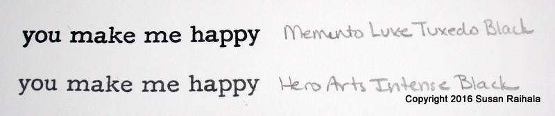
Here's a card I made with the hybrids, though I used Memento Luxe tuxedo black for the sentiment.


The tangerine stamped fine on the first try, but the deep ocean required two impressions to look good, which got me thinking.

Thinking is a dangerous pastime.

For a while now, I've accepted that individual results WILL vary when it comes to ink. I adore beyond words the performance of my Memento Luxe tuxedo black ink, but Joan hates that ink. Now, Joan is no newbie to stamping, so it's not like she's "not doing it right." The ink just works differently for her. She loves Versafine black, but I threw mine in the trash out of frustration (or sold it in a grab box...honestly, I don't remember). I'm no newbie, either.

Inks also work differently on different papers. For example, I hated using StampinUp's real red on their whisper white card stock because it took forever (read days) to dry and I always smeared it, but when I used it on Papertrey's stampers select white, it dried quickly and is by far my favorite red ink EVER.

Some inks, like most of the Hero Arts shadow inks, work great with block stamps but not so cleanly with outline stamps. Some pigment and chalk inks work awesomely with outline images while I find getting even coverage with them on block stamps a huge challenge.

I've even had different results from different colors in the same ink line. Some Impress Fresh Inks, for example, dry very, very slowly (if at all) on the Papertrey white paper I use most. Other colors dry in a blink on the same paper. And on the above card, the tangerine looked fine, but the deep ocean didn't.

What is going on here?

I have no idea, but that doesn't stop me from speculating.

To test my speculations, I pulled out my new MFT set Circle Scribble Flowers, which contains an outline and block stamp for each image. This was perfect for comparing the ink performances. Here's what happened.


A few things to note on the the blues. The Hero Arts Bold Ink ocean deep looks fine with the outline stamp, but the block is sort of ugly. The blotchy results might have smoothed out with a second inked impression, but really, we shouldn't have to do that. The VersaMagic Ocean Depth looks AMAZING with the outline image but the block image is uneven, despite careful inking of the stamp. The Memento Luxe teal zeal looks AMAZING with both the outline and block images.

But both the Memento and VersaMagic lines lack a bright, bold ocean blue shade. Could it be that the pigment that gives us that amazing shade of blue is creating the problem? I wonder. Because the tangerine Hero Arts Bold ink looks fine. See?


On close-up, it's easy to see that the hybrid orange doesn't work as well as the utterly perfect shadow ink on block stamps, but it is nowhere near the badness of the deep ocean. I consider that hybrid orange block image to be acceptable. The hybrid, however, works better than the shadow ink for the outline image. For sure.

Now for the blacks.


For a nice, rich black, I really, really, really love Memento Luxe tuxedo black. The Hero Arts Intensive Black looks gray in my picture, and the results with a sentiment (my major use of black ink) are not as crisp...but not too bad, either.

So what are my conclusions? First, I suspect that any ink purchase whatsoever is pretty much a crap shoot. You might find something you love and can't live without, or you might want to throw your purchase in the trash. Reviews like mine or Joan's are fascinating and somewhat helpful, but please ALWAYS remember that INDIVIDUAL RESULTS WILL VARY. Using different paper, different stamps, different pressures WILL yield different results. Also, I suspect humidity, age of pads, level of inking, and nature of different pigments are also wild-card variables.

Inks, like life, teach us to be flexible and to deal with disappointment. My recommendation, if you want to try a new line of inks, is to start cautiously, as I have here. Just a few colors (two complementary shades are a nice place to start). Don't buy the whole new line right off the bat.

Also, while the Hero Arts Bold Ink ocean deep isn't performing as well as I hoped on the larger block stamps, there are some hbrid colors that look very different from others in my stash that I will still try. The tangerine is almost exactly the same shade as the orange soda, which is disappointing because online on my computer screen it looked darker. But no matter. It clearly stamps outline images better than the orange soda, so I'll use it.

For those of you operating on a shoestring budget, I suggest seriously limiting your ink purchases to colors you will actually use in formulas for the stamps you most often use (outline or image).

For those of us whose husbands have expensive hobbies and thus feel freer spending more money (to keep things fair, you know...;-)), buy what looks pretty and give it a shot!

Supplies
stamps: CAS-ual Fridays Sunbeams; Papertrey Faux Ribbon
ink: Hero Arts Bold deep ocean and tangerine; Memento Luxe tuxedo black
paper: Papertrey white
accessories: craft foam, corner rounder, glue, Stickles