Friday, August 31, 2012

A Final Red Snowflake Card and Some Comments

This card, which was actually the first of my red snowflake cards I made because I happened to have a strip of white card stock lying on my desk. THREE layers, because it really seriously needed the red mat.


After making this one, I made the two-layer red snowflake card, and then I made the one-layer card. I made a fourth card, even more minimalist, but it's ugly and unbalanced and I shall not post it.

This girl's got standards.

But I often start with a more complicated idea (well, as complicated as we get around these here CASland parts) and gradually strip the idea down to its minimalist essence. In this case, between the three acceptable cards, my favorite is actually the two-layer card, closely followed by the one-layer version. The three-layer is nice, but it's too much.

You are, as always, entitled to your own opinion.

The comments on the last post regarding religious and non-religious sentiments for holidays cards were wonderful. Thanks so much to you all, but expecially to Sarah, Joyce, and Harriet, who let me know that I do, indeed, have Jewish friends in Cyberspace. That makes me happy. Very happy. Sometimes I really love the internet.

Tania reminded me in her comment that a nice font can trump the actual words, too. Size and style of font has to coordinate with the images to create a nice, balanced design. I sometimes change the sentiment for that reason and no other!

In the card above, I chose the sentiment for its size and the fact that its visual weight was about equal to the snowflakes, but its orientation was horizontal, like the strip of red card stock. Looking at the photo, I want to add bling near the sentiment, perhaps two small rhinestones on either side of "blessings."

But maybe not. There's quite enough going on here!

Anyway, thank you all for your comments, and have a wonderful weekend. Americans are celebrating Labor Day this weekend. May your holiday be safe and fun!

Supplies
stamps: PaptertreySnowflake Serenade and Signature Christmas
ink: SU real red
paper: PTI white; SU real red
accessories: rhinestones

Thursday, August 30, 2012

A Different Red Snowflake Card

Tonight's card is a variation on my one-layer red snowflake card. This time, I used a small, raised panel for the stamping. Love all the white on this one!


Generally speaking, I prefer Merry Christmas as a sentiment for the holiday cards I send, but I always like to have some secular cards on hand for the people on my list who I know are not Christian, and for years I made a Hanukkah card for my one Jewish friend. I was so sad the first holiday after she died, and I made some Hanukkah cards for the troops in her memory.

And isn't it sad that I have no other Jewish friends? I need to work on that.

The troops include all faiths and those of no faith at all, and so I'll make plenty of non-religious holiday cards to send to OWH. I'm not one to force my faith on others, but I expect to be able to express my faith freely and without prejudice. I allow others that same right, and don't blink or judge when I receive season's greetings. Heck, I'm just grateful somebody thought enough to send me anything at all!

What are your feelings about secular versus religious sentiments and themes on holiday cards?

Supplies
stamps: Papertrey Signature Christmas, Snowflake Serenade
ink: SU real red
paper: Papertrey white
accessories: dimensionals, red rhinestones

Wednesday, August 29, 2012

Bless You

Another crazy day. Crazy good, but crazy. I'm fried. Remember the old commercial about drugs..."this is your brain on drugs" [picture an egg], "this is your brain on drugs" [cracks egg into a hot frying pan].

That's me. Without the drugs.

So I'm going to share a simple card I made for our Bible study class to give my friend Zandra, who watched our children this summer. She's amazing and kind, and Nick loves her. He preferred to stay home Tuesday mornings before Zandra started watching the kids, which was fine, but after she started, he couldn't wait to get to church.

Amazing.

Anyway, here's the card, which uses a very old stamp from who knows where.

Card Size 6.25"x4.5"...that stamp is big!

I started with a single stamped panel on a white base. Then I tried a pink mat. No good. So I tried a white mat, and no dimensionals. That's what it needed.

And a couple of pink butterflies with pearl bodies...just because that Martha Stewart punch is wonderful.

May the Lord bless you, too.

And don't do drugs. It's easy enough to get fried without them.

Supplies
stamp: unknown
ink: Memento black
paper: PTI white; SU razzleberry
accessories: Martha Stewart butterfly punch, half pearls

Tuesday, August 28, 2012

Red Snowflakes

Crazy day, so not much to say this evening, and perhaps I said too much yesterday. *chuckle*

So here's a card that's easily explained with two words: visual triangle.


The OLW challenge this week is going to be posted on Karen Dunbrook's website, so check it out Wednesday morning!


Supplies
stamps: Papertrey Snowflake Serenade
ink: SU real red
paper: PTI white
accessories: corner rounder and rhinestones

Monday, August 27, 2012

One-Layer Wednesday 102: While We're on the Subject

Ardyth's first OLW challenge is to make a card based on your favorite school subject.

Well, I often have a problem with the word favorite (or favourite, as Canadian Ardyth spells it). I loved most subjects in school except physical education, and yet somehow I still ended up taking two pleasurable semesters of swimming in college, despite the fact that I chose Duke because there was no physical education requirement.

But given the fact that I majored in English and went on to earn a graduate degree in English literature, it was only logical for me to make a couple of literature-themed cards.

Oh how much fun I had! Thanks, Ardyth, for giving me an excuse to parade my geekiness for the stamping world to see!


First up, a card using Papertrey's All Booked Up. That book is one of my favorite images EVER, because it's so simple and big and clean and perfect. Coloring the bookmark my favorite color: pear tart. And now I'm giggling because pears are part of the reason I majored in English, but that's another story.


Next, I pulled out my alphabet stamps and made a fun word collage of some of my favorite authors' names. The inks are angel pink, black, london fog, and gray flannel from Memento. The hearts are arranged in a visual triangle, as are the names for each color.

Ooops.

Just realized I forgot the dots over the e in Bronte. I'd planned on using a colon stamp on its side to make that umlaut or whatever you want to call it.

Just realized I have no idea how to type the html code to make the umlaut in Blogger.

I can live with that.

What a fun challenge! If you haven't played, there's still time. What's your favorite subject?


---------------------------------------

For those of you who read Simplicity for stamping, you are excused. For those who read because I rattle on weirdly about whatever's in my head, you may stay, but only if you like literature, because really, this is some serious literary nonsense.

Chaucer wrote Canterbury Tales, and I wrote my master's thesis on The Wife of Bath's Prologue and Tale. But the best tale in Canterbury Tales is The Miller's Tale. It's a big part of why I majored in English...because it's bawdy and it's literature! Literature can be bawdy, and oh, my, that makes it fun! Another reason why I majored in English is found in The Merchant's Tale, where a pear tree figures largely in the plot as the place for an illicit tryst. The shape of the pear...oh, never mind. Just read this.

Keats wrote "Ode to a Nightingale," one of the prettiest poems in modern English, and my paper on it earned an A from Professor Gleckner. Keats' "Ode on a Grecian Urn" wasn't too shabby, either.

Milton wrote Paradise Lost. In 12th grade, my paper on Paradise Lost earned me an A+ for the rest of the year. "There's nothing more I can teach you in high school, Susan," said Mr. Lentz. "Now, write like that for some reason other than the grade." There's a reason why Sylvia Plath isn't on this card. The next paper I wrote was on her Colossus, and it was beyond terrible and so very hard to write. I studied Milton again with the famous Reynolds Price (novelist and scholar) at Duke. You can read about that here.

Jane Austen. Pride and Prejudice. Can you just imagine how horrible the world would be without Darcy and Lizzy? It doesn't bear considering.

Wordsworth wrote all sorts of amazing poems, but the one that sticks with me is "I wandered lonely as a cloud." I like daffodils.

Charlotte Bronte wrote Jane Eyre, of course, but less well known and even better is her novel Villette. This novel provoked a firestorm of controversy in my graduate class on the Victorian novel, taken with Dr. Nancy West, who was an absolutely fabulous teacher. If you haven't read it already, please do so, and then tell me if you liked the ending or if it made you flaming angry.

Shakespeare wrote a bunch of sonnets and plays. Some are truly great, some are really good, and a few are just annoying. My favorite plays are Hamlet, Much Ado about Nothing, A Midsummer Night's Dream, and The Tempest. Which are your favorites?

Joseph Conrad wrote The Heart of Darkness. It contains the single creepiest-yet-beautiful-sounding sentence in the English language: "A taint of imbecile rapacity blew through it all, like a whiff from some corpse." Yep. Read that when you're sixteen and suffering major depression. It'll stick with you.

And then there's Dante, author of The Divine Comedy. It's just cool. In a literary sense, of course, it's truly brilliant, genius, absolutely remarkable, eternally complex. Plus, Dante figured out a way to put all the people who annoyed him in real life into hell and had the fun of showing how they were tortured for eternity for their sins. That he could be so petty and write such an amazing piece of literature at the same time is so medieval. When I was introducing it to a World Lit class I taught at Troy University, I actually teared up and wasn't at all embarrassed.

But great literature has that effect on us English majors. We're weird that way.


Sunday, August 26, 2012

Layers, Oh My!

Given that I make so very many Christmas cards each year, it's no surprise that I have to vary the color choices a bit to keep from going insane. Christmas green and red, or blues for snowy cards, grow boring very quickly. So today's card shakes it up a bit with Baja Breeze and River Rock from Stampin'Up.

And layers. Because sometimes even I have to layer.


The stamps are from Papertrey's Snowflake Serenade, which has been around for a long time. But the snowflakes in the set are simply lovely, and there are two big words--peace and joy--with assorted little words to embellish the big word on the outside of the card and inside. A very cleverly designed set.

A single snowflake reminds me of the Christmas star and so seems doubly meaningful for those of us who have a chance at a white Christmas.

I don't always double-mat, but when I do, I generally make the bottom mat bigger than the top mat. Not only does it add interest, it also grounds whatever your stamped panel contains more firmly to the card base. For stamped panels where nothing is leaking off the panel (stamped part-way on, part-way off the panel), using different-size mats can help unify the whole design.

It's very hot in Ohio today, but just looking at the colors of this card gives me hope that, indeed, we will have some snow this winter.

Supplies
stamps: Papertrey Snowflake Serenade
ink: SU river rock, baja breeze
paper: PTI White, SU river rock, baja breeze
accessories: half pearl, dimensionals

Friday, August 24, 2012

Stardust Pens Are Bunny!

So, if you have a 12-year-old boy around, you may have heard the term beast, as in "That's so beast!" I'm pretty sure beast means something like cool, amazing, really swell. At least, that's implied from the contexts in which my 12-year-old boy uses it.

One night at dinner, Nick called something beast, and George asked, "Why are things beast? Why not a happy word, a feel-good word. I think you should call things bunny. That's so bunny. I like it!"

And ever since, cool things in our house are bunny.

Cool things like Sakura Stardust pens. In red.

SO BUNNY!!!!


What a great way to add a little something special to a card without adding any bulk at all. The ink is opaque, so you can cover up other colors with it...which is perfect with stamps like this one.

If you need more bunny in your life, get at Sakura stardust pen.

Supplies
stamps: Papertrey Winterberry, Signature Christmas
ink: Memento cottage ivy, love letter
paper: PTI white
accessories: Sakura stardust pen...so bunny!


Thursday, August 23, 2012

Thought You Ought to Know...

Hello! Before anyone starts to worry ('cause some of you actually do, and I love you for it), everything in my world is just ducky. Busy with back-to-school stuff, but ducky. And as I've had so little time to stamp, I have nothing to post. I'll be back soon, though, unless the zombies eat my brain.

If that happens, well, you're on your own.

Tuesday, August 21, 2012

A Hint of Things to Come

Note: The OLW challenge this week is on Ardyth's blog and will go live Wednesday morning! Welcome to the team, Ardyth!

The deadline for Christmas/winter holiday cards for Operation Write Home is October 31st if you're stuffing them in envelopes yourself. If you're just sending the cards for the volunteers to stuff, then the deadline is October 11.

That means I'm getting jiggy with Christmas cards, so you'll be seeing lots of them on this here blog until October. After that, I'll be working on my own Christmas cards.

Good thing I love Christmas. Hope you do, too!

Today's card has lots of white space, so of course I love it.


The poinsettia is made with a flower punch, or rather, two punched flowers offset and glued together. A dot of gold Stickles in the center and a bow behind the flower complete the effect. The bright red (SU real red) and the Christmas green (Memento cottage ivy) pop nicely on all that white, and the strong focal point makes the message clear with intense minimalism: Merry Christmas.

Well, in French, because I liked the look of the umlaut.

English is sadly lacking in umlauts and accents. Alas.


Supplies
stamps: Papertrey Winterberry
ink: Memento cottage ivy
paper: Papertrey white, SU real red
accessories: green craft floss, dimensionals, tag punch (Marvy), flower punch, glue pen, Stickles (gold)

Monday, August 20, 2012

I Heart Bling

Dot Spot is such a fun Papertrey set, and I love using it to play around with different color schemes and a simple, perfect layout.

Citrus colors are warm and happy.


Blues and green are cooler and harmonious.

For those of you who have wondered what "visual triangle" means, I refer you to the bling on these cards. The triangle lends unity to the design, which is further enhanced by overlapping the sentiment, rather than placing it off by itself. All the elements work together to create a strong focal point.

And there's bling.

Bling. It makes me happy.

Seriously!

My primary source for bling is Michael's. The Reflections line has a variety of colors in packets that contain three sizes: tiny, medium, and large. You may also purchase packets containing extra large and jumbo rhinestones, but they are generally too bumpy for me. I usually run out of the tiny ones first, but today's cards allowed me to use up some of the large ones.

The packets have individual dots of adhesive under each rhinestone rather than a line of adhesive that required cutting with scissors or a craft knife. I still use my craft knife to place bling...it works so nicely. Just be careful not to puncture yourself.

Safety first!

And by the way, if you need a color of bling that you can't find in stores, just buy clear bling and use a Copic, Sharpie, or Bic marker to color it. Use a darker shade than you want because the bling will come out lighter than the ink.

You're welcome!

And I've now used my daily allotment of egregious exclamation points. Please go forth and make it a bling-y day!

Supplies
stamps: Papertrey Dot Spot, Signature Greetings
ink: Memento Bahama blue, pear tart, sky blue, tangelo, cantaloupe, black
paper: PTI white
accessories: rhinestones, Bic marker (for the Bahama blue rhinestone)

Sunday, August 19, 2012

This Whine Is a Bit Fruity

Just kidding. I'm not feeling whiny at all, but that might be because I'm drinking a nice glass of Irony pinot noir.

I decided to focus only on mainstream sentiments for a while, at least for my OWH cards. Some sentiments are a little weird for cards, aren't they? "Live Your Bliss," anyone? And for some reason, this bit of decision-making lead me to resolve to use all my sets again. I'd been half-way doing that but without method or accounting (which you know I need because I'm weird that way). But I've started a list of the sets I'm using, and today's cards helped me use three sets: Papertrey's Mega Mixed Messages, Fruitful, and Framed.


The raspberry card uses Memento inks (two shades of pink and bamboo), and the lime card uses SU's green galore, which is the best lime green EVER. I love how nicely the sentiment fits into the Framed opening. I dressed both cards up a bit with bling/pearls and like the effect.

I've had some questions about colors I'm using, and I'll try to do better letting you know. It's hard to remember the names of the Memento inks sometimes (for example, the top card uses whatever the hot pink and magenta shades are called). For reds, I use SU's real red and Memento Love Letter most. Memento's lady bug is a little orange for my tastes. For dark reds, I use Memento rhubarb and SU cherry cobbler. I also have Brilliance Rocket Red, which is very nice.

Hope that helps!

Friday, August 17, 2012

About 40 Minutes on the Farm

Ever since I finished my craft space reorganization, I've felt a bit aimless with my stamping. Actually, I have been a bit aimless for months now, feeling the itch to shake things up a bit, though whether the shake-up will appear on the blog or not remains to be seen. I have too many ideas and need to settle on one or two and get hopping.

But I procrastinate.

Bet you don't know what that feels like, eh?

Anyway, Wedesday I pulled out On the Farm from Papertrey and decided to play around with it. Here are the cards I made, in the order I made them, in the roughly 40 minutes my children allowed me to work.

I hope my commentary shows not only how cards that are near-misses can be helpful for learning, but also how loosening up and playing with something can be fun! Or funny. Depending on your sense of humor.


I really love the layout and colors above, but I don't love how the green ink shows so strongly through the rusty color I used for the rooster. A little show-through is fine, but this is egregious. He'd be a pain to cut out and pop, so the solution in the future is simply to use a darker color for him. The bling creates a visual triangle...before I added them, the card looked mighty boring and incomplete.

When in doubt, add bling. You can go a bling too far, but it's better to have blinged and failed than never to have blinged at all.


As you might suspect, I just love all the white space on this one. Red and brown make a fun color combo and pop nicely off the white. The chickens are "looking" at the sentiment, which creates the feeling of movement even with so few elements. The rooster wouldn't work on this layout...he's looking the wrong way.

Just like a man.


I'm not a fan of puns in general, though I recognize their popularity in stamping and give in occasionally to the fun. But "herd it's your birthday"? Seriously? Bovine ridiculousness.  I love the weathered frame, though, and hope I can remember it's there for use with other sets. I also like the placement of the label stamp on here.

Did you know a major contributor of the greenhouse gas methane is cows? They fart a lot.

Just sayin'.


Finally, here's a card that works in some ways and not in others. The colors are fun, and the use of the border stamp works nicely, but the three images do not. The chicken and rooster are looking at each other (nice design...planned, I'm sure, by Nichole when she designed the set), but the label is floating in the air, which wasn't a good design choice on my part. Oh, to be able to have an ink eraser! Then, when I stamped the sentiment, it just got lost...not dark enough. So I added the brown half-pearls to draw attention to it, but they are just too heavy and look out of place on the card.

Perhaps I should remake this one, change the sentiment to Happy Anniversary, and ditch the label. Or maybe add a few hearts floating above the happy cluckle.

Couple. Cluckle. Chuckle. *snort*

I'm sorry. Not sure what's gotten into me.

Supplies
stamps: On the Farm, Birthday Basics (Papertrey)
ink" Memento
paper: PTI
accessories: half pearls, rhinestones

Wednesday, August 15, 2012

Painting Fabric

About a month ago, I experimented once again with painting muslin. This time, I used shimmery Twinkling H2O paints. The process was simple: put the fabric on a waterproof surface, paint it with plain water to wet, then paint with the paint and let dry. I didn't get fancy with the colors or try blending...just wanted to see if the shimmer would show on fabric.

It does, but not hugely. In the future, I might add the Tattered Angels glimmer mist over the Twinkling H2Os.

Here's the card I've made with the painted fabric. I love the subtle texture of the fabric with the smooth white card stock, and the blue is just so pretty!


The white-on-white frame allows the blue fabric to take center stage.


For those of you who don't read the comments on my posts, I wanted to share Joan's story from the colander post. It's adorable.

"My Polish grandmother came over on the boat through Ellis island and got a job as a housekeeper. One of her tasks was to buy a colander. Since she didn't know the english word, she went to the store and asked for a "Macaroni stop, Water go". So your post brought a smile to me today."

Joan brought a smile to me with this, and I wanted to share!

Supplies
stamps: SU
ink: Memento gray flannel
paper: PTI white
accessories: scor-tape, dimensionals, Martha Stewart butterfly punches, white muslin, Twinkling H20 paint, large watercolor brush, rhinestones, glue pen


OLW101, Feeling Blue

Click on over to Heather Telford's blog for the latest OLW.

Mmmmm. Blue. LOVE it!

Also, someone said they couldn't find what was wrong with my balloon card for OLW100. I screwed up the coloring of one of the sections of the lowest balloon by crossing the line with the wrong color, but I covered up the mistake with the Sakura pen, so it's no longer visible. Sorry I didn't make that clear in the post.

A decent rescue effort, if I do say so myself!

Tuesday, August 14, 2012

OLW100 Rescued, and Why You Need a Colander for Stamping

My OLW100 card is a rescue. I colored in the balloons from Papertrey's Up, Up, and Away set after stamping them in a nice visual triangle. When I was coloring the last, smallest balloon, my hand jerked just enough to ruin the whole thing.

Darn it all to heck.

Then, it occurred to me that Sakura stardust pens, which I have in a variety of colors, might cover up the mistake. They put down a nice, shimmery, almost opaque layer of ink. So I rummaged through my embellisment drawers for the best colors, and fixed the mistake by adding a little Sakura to each balloon...not a lot, just enough to make it look on purpose.


The results are fine, but it really would have looked better if I'd never made the mistake at all. The Sakura pens are just a little too dark giving the Copic colors I was working with.

Why You Need a Colander

A number of you were baffled about the colander hanging in my craft space. Here's the reason it's there.

Clear stamps lose their stickiness with use. Dust, dirt, and oil from your fingers make them less sticky. They eventually won't stick to acrylic blocks or CD storage cases, and then it's so very easy for them to get lost.

To restore the stickiness, all you have to do is wash them in water with dish soap and let them air dry.

But so many clear stamps are TINY and therefore easily lost in a sink of soapy water.

Hence the colander.

I put my clear stamps to be cleaned in the colander, and then set the colander in a sink of shallow, soapy water. I run the stamps between my fingers to clean them under the water, without ever moving my hands or the stamps out of the colander. Then, I lift the colander out of the soapy water, rinse well under fresh running water, and move the colander away from the drain that wants nothing better than to suck a precious stamp into oblivion.

The stamps air-dry nicely on a Bounty paper towel--Bounty brand doesn't shed lint like cheaper paper towels do. I place stamps with the backs up to keep the adhering surface as clean as possible. When dry, the stamps go back into the CD cases, where they now stick quite nicely.

Now, you may ask why you can't use your kitchen colander for such a job. Well, you certainly can, but as some inks may not be safe for ingestion, you might contaminate the colander. The chances of this are extremely slim, but I find it helpful to keep crafting and kitchen supplies separate. The mesh colanders are cheap, and it's always good to be too safe rather than not safe enough.

There you have it: if you have clear stamps, you need a colander.

Supplies
stamps: Papertrey Up, Up, and Away
ink: Memento black
paper: Gina K deluxe white
accessories: Copics, Sakura stardust pens

Monday, August 13, 2012

Sympathy with Cheese Cloth and Comments on the new SU Catalog

Okay, so yesterday's card using cheese cloth was inspired by the PaperCraft's Magazine article on using fabric on cards. I actually picked up the cheese cloth after reading that article and bumping into a cheese cloth display at the grocery store.

Pretty cool, eh?

Today's card uses a bit of cheese cloth on a sympathy card. I love how the frayed edges reflect the feeling of grief...oh how loss frays our hearts!


Very clean and simple, with texture and shape as the main design elements.

This will (hopefully) be the last sympathy card I make for a while. I've replenished my stash and highly recommend you do the same. Making sympathy cards when they are specifically needed is so much harder!

The New SU Catalog

I've had the catalog for weeks now and may very well be placing an order soon.

My relationship with SU has changed over the years. I'm moving away from using much colored card stock, so matchy-matchy isn't as important as it was four or five years ago. I've also found myself not using the inks much, either, except a few key colors (especially cherry cobbler, real red, and sahara sand). My boxes of stamps to sell also contain quite a few older SU sets...not because I don't like them, but because I've had them for so long and have used them to my satisfaction.

I guess what I'm saying is that I don't use as much SU now as I used to, but it's still a great company with very high-quality product.

The catalog itself is lovely, if a bit busy in design for my taste. SU's sample cards are pretty and fresh, in my opinion better in quality overall than the ones in the last catalog. I also really like the product suites...pages showing coordinated products from the whole line for a particular look. Again, the suites are visually busy, but there's so much there to inspire!

My biggest complaint about the catalog has to do with number of sets: so many Halloween sets, so few Thanksgiving sets. If you're a regular reader, you know my feelings on this subject. Even the holiday mini is light on Thanksgiving heavy on Halloween.

But let's not quibble.

The sets on my long list (this will get whittled down to just two or three) are as follows:

Christmas Blessings, p. 19
Happy Hour, p. 36
Serene Silhouettes, p. 75
Nature Walk, p. 79
Summer Silhouettes, p. 82
Fabulous Florets, p. 83

Like I said, they aren't all new, but I don't think I can go wrong with any of them!

So what have you ordered from the catalog? What are you enjoying using and what isn't working for you as well as you thought it would? What are your thoughts on the catalog?


Supplies
stamps: Papertrey Simple Little Things
ink: Memento Gray Flannel
paper: Papertrey
accessories: dimensionals, cheese cloth, SU oval punch

My Craft Space, Part Two

Shall we continue the tour of my craft space?

Certainly. Here's the right side of the space.


The baker's rack, which has served me well for eight years, houses a bunch of stuff. Across the top are jars of ribbon. Decorative, aren't they? Especially since I hardly ever use ribbon anymore.


Below the ribbon shelf are the green bins that house my Papertrey sets. I'm going to re-do the old tabs because the pink really stands out unattractively now in the new storage, but one thing at a time. These bins already look a little different because I purged about seven or eight sets to sell. That leaves more room for new sets. Yay!


On the bottom of the rack are four three-drawer 12x12 storage units. These hold a variety of tools, templates, envelopes, office supplies, pens (scrapbooking, mostly), spool ribbon, fabric, and fabric accessories.


The big, black bookshelf is new to my crafting space. I got rid of a LOT of books to free this up for crafting. The white photo boxes ($2 each at Michael's on sale) now house most of my wood-mounted stamps and Hero Arts clear sets, all of which used to be kept in four large plastic drawer units. I didn't like the mismatched drawer units, plus the stamps were exposed to light through the plastic, which may or may not have been good for them. The boxes protect the stamps from sunlight and are clearly labeled. Since they aren't stacked more than two high, it's easy to pull out what I need without a struggle.


The two light-green photo boxes hold cards that I've made to use (one box for Christmas, the other for everything else in my stash), and the blue box holds cards people have sent to me that have been retired from the cork board.

The big green basket holds a variety of interesting things that may or may not one day be used on cards, such as an out-of-date road atlas, some muslin I painted with shimmering paints, and die cuts friends have sent. There's another big green basket on top of the bookshelf to hold larger projects (such as teacher gifts at Christmas) when needed. I like using baskets to store projects in progress. It's just so tidy.

The binders used to house my stamp inventory, but that has become laughably out-of-date. Not sure if I'll ever bring it up to speed, so those binders will likely be repurposed. Obviously, the bottom shelves house craft books, magazines, catalogs, and notebooks.


Beside the bookshelf is another cork board (a girl can't have too many of these). It contains a Chinese glue brush for bookbinding (decorative), a colander for cleaning clear stamps (which doesn't fit anywhere else), a big metal ruler for cutting large sheets of paper or mat board, and some lovely things friends have sent.

The strip of paper across the bottom right is from my youngest son when he was in preschool. His teacher asked what he knew about dragons. "The dragon eats the princess," he replied.


Finally, here are two more plastic drawer units. The one on the left holds Christmas stamps and large alphabet sets. The one on the right is completely empty and will likely move to storage soon. Because there is so much light in this area, I cut some card stock to slide in front of the stamps to protect them a bit.

The small green baskets hold a variety of smaller projects, as well as finished cards that need to be put away/mailed to OWH/sent to someone.


If we take a look at the whole space again, you can see how the dominant colors are white (curtains, furniture, photo boxes, plastic drawer units), black (bookshelf, chair, picture frames), and splashes of happy green. The simplicity of the color scheme keeps the general effect of the space unified and clean...at least when it's all tidy!


The advantage to having such organized storage is that I can find everything AND I can put it all away quickly and easily when needed. Typically, I make a big ol' mess when working, but before starting a new card or project, I clean everything up. Order keeps the cleaning quick and easy, leaving more time for playing!

And there you have it. My craft space. Hopefully, you've seen an idea or two that will help you with your own organizational conundrums.

Sunday, August 12, 2012

Ira Glass on Creativity and a Card

I found this on a blog called The Writer Underground, via a Facebook link by Michelle Mathey. Thanks to Michelle for the link and to The Writer Underground for a wonderful blog.


“What nobody tells people who are beginners — and I really wish someone had told this to me . . . is that all of us who do creative work, we get into it because we have good taste. But there is this gap. For the first couple years you make stuff, and it’s just not that good. It’s trying to be good, it has potential, but it’s not.

But your taste, the thing that got you into the game, is still killer. And your taste is why your work disappoints you. A lot of people never get past this phase. They quit. Most people I know who do interesting, creative work went through years of this. We know our work doesn’t have this special thing that we want it to have. We all go through this. And if you are just starting out or you are still in this phase, you gotta know it’s normal and the most important thing you can do is do a lot of work. Put yourself on a deadline so that every week you will finish one story.

It is only by going through a volume of work that you will close that gap, and your work will be as good as your ambitions. And I took longer to figure out how to do this than anyone I’ve ever met. It’s gonna take awhile. It’s normal to take awhile. You’ve just gotta fight your way through.”

Glass is speaking about producing radio, of course, but as the Writer Underground states (and many of his/her readers add in the comments as well), these words apply to any creative endeavor: writing, rubber stamping, any art form at all, teaching, graphic design, advertising, engineering, theoretical physics and any of the basic sciences, gardening, home decorating, fashion, painting your nails. Whatever you want to do well, you do better with practice and can become really good with taste.

There is one distinction I would like to make, however, as Glass's words relate to hobbies as opposed to careers.

You don't need taste to have fun and enjoy the creative process. Whatever you make that makes you happy is good enough.

What Glass addresses is public creativity, the kind that seeks to participate in public discourse. If you want to make a living doing something, you have to plug into the public discourse on the subject. You need to speak the language, learn all the rules (and there are always lots of rules) so you can have good judgment in breaking them, and actively seek to nudge the discourse in new ways that make other people say, "I wish I'd thought of that!"

Hobbies don't need to have this level of ambition to be fun and worthwhile, but if you want to make prettier stuff, stuff that makes your soul happy, you can work on your skills to get there. I find Ira's words relevant to my life as a writer on one level (the public discourse level) and another level as a hobby stamper (the private satisfaction level). Writing comes naturally to me and always has; I work on it constantly, but it's so much fun that it doesn't feel like work...more like a compulsion.

Stamping does not come naturally. For years I experienced that level of disappointment Ira talks about with most of what I made, and I worked hard to close the gap between my design ability and my taste.

Now, however, I've tipped the scale with all that hard work. Most of what I make makes me pretty happy, regardless of my objective opinion about it. I still totally blow it every now and then, like Friday when I tried to make a hot-air balloon card for the OLW100. Yikes. Generally, I see that what I make is good enough, and occasionally I hit a metaphorical home run. But it's all a learning curve, and frankly, I hope I never get it all figured out.

Because then it would be boring and I'd quit.

If you're in that disappointing place where your skill does not meet your taste in this wonderful hobby, take heart from what Ira says. Work hard making stuff. You'll get there eventually.

Because if I can do it, anyone can!

Five years ago, I could not have made this card. Now I can. Five years from now, I might see a dozen things on this card I could have done differently to make it better. But for now, it makes me happy because 1) it was inspired by an article in PaperCrafts about using natural fibers/fabric on cards (this is cheese cloth I picked up at the grocery store), 2)  it has two visual triangles (pearls and sand dollars), and 3) it's light and clean and simple.


Life is good, and so is creativity. 

So live life and create stuff.

Sounds like a great recipe for happiness to me.

Supplies
stamps: Papertrey A Day at the Beach
ink: SU sahara sand
paper: PTI white, SU sahara sand
accessories: cheese cloth, half-pearls, glue stick, dimensionals, Martha Stewart sand dollar punch, 7/8" circle punch

Saturday, August 11, 2012

My Crafting Space: Part One

The Background

In our old house, my craft space was the fourth bedroom, tucked away from all public areas yet, because of the acoustics of the house, open to all the sounds of the home. I could hear my children and their friends playing (when they didn't think I could!), I could hear my husband coming in the garage door, I could hear the silence that means children are being naughty.

That space was perfect because I wasn't isolated yet no one had to look at my room full of plastic storage drawers and mismatched furniture...all of which were perfectly serviceable and optimally organized.

And then we moved. The fourth bedroom in the new home is the quietest place in the whole house, tucked in a corner of the finished basement. I could hear nothing in there, not even a child screaming in pain upstairs. The privacy was nice, but I found myself uneasy every time I was crafting and kids were home, popping up every few minutes to check on them. It was lonely and distracting.

So I moved to the nook in the finished rec room of the basement--not a perfect solution by any means, but better than the bedroom. It's public space, the first thing you see when you walk down the basement stairs. For the first time ever the mismatched furniture and plastic bothered me.

Really bothered me.

Unfortunately, we aren't made of money and a trip to Ikea for matching, functional, yet not terribly expensive furniture is not in the budget this year, and perhaps not even next year.

Whatever is a girl to do?

Work with what she has to make it look as good as possible.

The Process

I wish I had before pictures, but I don't. Here's the whole space now, which is mostly finished. I still want to come up with a better arrangement of art over my main desk and better punch storage.


I spent many, many hours contemplating the space before doing anything at all. The rowing machine is set up so I can stare at my craft area while rowing. Amazing what good thinking one can get done as one's body goes on autopilot exercising!

A few thoughts that governed my overall plan.... First, I don't like to sit for long periods of time in my craft space. I have to sit at the computer while writing, so I want to get up off my butt when stamping. This means not everything is organized to be most efficient. For instance, I have to stand and walk to get paper, which is behind the desk, and then walk to the cutter and scorer to make a card, and then sit down. This doesn't qualify as exercise but at least keeps me moving.

Second, I'm in a long-term phase of gradually purging my craft supplies. Years of acquisition have resulted in a weighty burden of craft crap, so much of which falls into the category of "nice to have, but haven't used in years." Urgh. What you see in this post is stuff that is out. I have boxes and bins of stuff in storage as well. My hope is that by the time I can make that Ikea trip for furniture, I will have a lot less stuff both in my working space and in storage.

Third, this is a pass-through area for the basement walk-out. That means the path to the door needs to stay clear of all but the dog's tennis balls. The sliding glass door behind the curtains opens on the right, hence the open path on the right.


The Space: Part One
Since I was stuck with the furniture, I tried to think of ways to make it more visually appealing without spending a lot of money. The ugliest piece by far is the battered wooden table held together with L-brackets because movers lost the hardware for holding it together years ago. I ended up with a spare green tablecloth (long story) and realized just hiding the ugly wood table with it would be easy and block the view under the table, which was visually cluttered and awkward.


On this table rest two vital tools for papercrafting: a paper trimmer and a scoring device. It's also a good space for my little computer and pencil sharpener. You can see the refrigerator in the background...that's where the wet bar is, so running water is quite close, as are cold beverages!

Hidden under the table are four 12"x12" drawer units that house my embellishments, sorted by color, as well as embossing supplies; colored pencils; and watercolor pencils, crayons, and paints. These used to be on the baker's rack on the wall opposite my desk, but placing them closer to my workspace has been very helpful in reminding me to use them, and I still have to get out of my chair and stoop to get into them. The Cropper Hopper scrap storage resting on top holds all my colored card stock scraps, sorted by color. That's a big ol' yes to OCD.


And yes, shoving the tablecloth out of the way is a bit unsightly, but you can't see the mess when standing, and it's unlikely a non-stamping guest will stoop down to the level of the picture!

My work table is huge and wonderful. And plastic. Oh, well. You can't have it all, I suppose.


The plastic-drawer tower on the left of the desk includes the inks I use most (Memento) and markers, scrap copy paper, stamping accessories (sponges, daubers, stipple brushes, etc.), white card scraps (the ones I use most), and adhesives. The smaller tower contains Sharpies, Bics, and Copics, organized by color. These are the only drawers I didn't label because the contents are so obvious. Tucked between for easy access is my 6"x6" quilting ruler, with which I do 99% of my layer cutting.

I don't always layer. But when I do, I use a quilting ruler. Cut safe, my friends.

The two items on top of the pen drawers are my stamp scrubber for particularly oogy stamps and a travel-wipe case with a damp washcloth in it for most of my stamp cleaning.


The immediate work space consists of a stamping pad (the burgundy mat that provides some "give" under larger images for better impressions, purchased at JoAnn's), a cutting mat for the quilting ruler and craft knife, and an apology note from my youngest.

The orange and green cups hold frequently used tools (scissors, knife, tweezers, pens, pencils, spare bone folder, etc.), and the white tray holds acrylic blocks for unmounted stamps and my glue bottle, stored upside down for quick use. The cork board above the space holds my proportional matting cheat sheet, notes on what size envelopes I have, a color wheel, and my reading glasses (for coloring...my eyes are older than the rest of me, apparently). This board will fill up with post-its and such pretty quickly.


The tower to the right on the desk contains ink. From top to bottom, Brilliance, VersaColor, VersaMagic, miscellaneous dye inks, specialty inks, and Stampin'Up inks. I've been gradually whittling down my inks for the past six months, and hope to get them even more whittled in coming months. At one point, I think I had about 400 pads...ridiculous by any clean-and-simple standard!


The plastic drawers are truly perfect for this job. They slide out very easily (no bumpers hold them in), meaning I can pull out drawers I need and stack them on the desk for easy access. I LOVE being able to do that! Seriously, I make a giant mess when I work (not that you can tell from these pictures!).

Under the desk, in a very unsatisfactory arrangement I'm still ruminating upon, are punches. This three-drawer set holds basic shapes (circles, ovals, scallops, squares). The blue basket holds border punches and deco scissors.


To the right of the desk is this tower of punches. My hope is to be able to whittle down the punches to the ones I actually use over the next six months or so. Once I have a smaller collection, a perfect storage solution will present itself. I hope.


The wall above the desk is proving problematic but I adore exceedingly the sketch paintings my mom gave me (well, I begged for them) during my last visit to Maryland. Mom is a fine artist who works in watercolor, oils, and pastels. She's a poster-child for loosening up and playing with her art, and these sketches are quick, unfinished studies she whips out to loosen up. I need to be looser, freer, like she is. So her colorful sketches give me the inspiration I need to cut loose and have fun!


Please note that she didn't sketch any pears.

Anyway, when I fix this wall, I'll share the photos with you. But please don't hold your breath. It's taken me five months to get to this point. Who knows how long it will take to fix this?

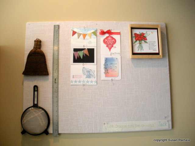
On either side of the sliding door, I put cork boards covered in white linen for a bit of texture, to post cards people have sent me. This collection changes as new cards come in.


For my next post, I'll detail the right-hand side of the craft space, where my paper and stamps and some other stuff are oh so carefully arranged. I'll also talk about my color choices for the space, where they work and where they need improvement!

Thursday, August 9, 2012

Fortuitous Sizing

Sometimes, a plan comes together even better than one could have possibly anticpated. Such was the case when I paired the a Happy Birthday sentiment from Papertrey and a definition stamp from Hero Arts. Add a dividing line, and what a cool texty card!!!!!


Today, I finished organizing my craft area. Yay! I'm going to snap pictures tomorrow and share my organization plan with you. Also, I really, really want to play the 100th OLW challenge over on Cheryl's blog. The theme is transportation, and I so want to pull out some stamps that have received far too little play!

Wednesday, August 8, 2012

Sing Your Song


Please scroll down for my earlier post today regarding the OLW number 100!


A lot of people claim to have simple answers to really complex questions. Have you ever noticed how insistent they can be in pushing their answers on you? I've noticed that people who have to be right are usually deeply insecure and have to be right or their entire world gets rocked.

Or they are politicians.

Anyway, the saying on this card implies a rather zen message to comfort the insecure. (Politicians, however, are beyond all earthly help.) Just sing your song.


You do not want me to sing my song to you. I have the worst singing voice on the planet. Well, maybe not the whole planet, but seriously, dogs close off their inner ears when I sing. I completely identify with the unmelodious penguin in the movie Happy Feet, except that you probably don't want to see me dance either.

So isn't it nice that the message here is not literal? It just means we need to be who we are, do what we need to do, and be happy about it.

I like that message.

Is anyone else bothered by the missing period?

Oh well.

I wanted the sentiment to stand out, so I put it in black. The grunge background is from Papertrey's Grunge Me set (love!), and though it's hard to see, I stamped a bit of the A Muse music background across the top as well. I rounded the top corner so the bird was flying toward something interesting and the lower opposite corner for balance. That Memento light blue is really too light, but my SU bashful blue has turned into ballet blue and is too dark.

Now there's a first-world problem for ya.

Can anyone recommend a light blue that's not too dark and not too light but just right?

Supplies
stamps: Papertrey, A Muse
ink: Memento
paper: PTI
accessories: corner rounder

OLW100--Transportation

You will find the latest OLW challenge--number 100!--on Cheryl's blog. As she explains there, Blogger didn't post as she'd scheduled.

I hope I have time to stamp tomorrow, but today got away from me, although I made HUGE progress with my craft space. I'm getting there, and should be able to post pictures of the interim space (as in "between utter ugly chaos" and "the final plan for new furniture and shelves") either this weekend or early next week.

The final plan will be years in the making, so I'm not holding my breath.

But never mind that. Just go play the 100th running of the One-Layer Wednesday Challenge!

Tuesday, August 7, 2012

The Dividing Line

First of all, thanks for your kind comments on my last post. Mwwwaaa!

And now to the cards. Another design element that crops up repeatedly in 1,000 Bags, Tags, and Labels is the dividing line between two elements (often an image and some text). I riffed on that idea in the following cards, using a stem from Green Thumb by Papertrey (PTI) for my dividing line.

PTI butterfly set, SU Define Your Life


Clear and Simple Limited Edition Thinking of You Set,
PTI Beautiful Blooms


PTI Masculine Motifs (globe), SU Define Your Life


This is such a great, clean design, and obviously very flexible depending on your images and sentiments.

How could you use what you have to get the dividing line look?

Supplies
ink: Memento
paper: PTI white and, for the last card, natural
accessories: post it to mask the line as needed.

Monday, August 6, 2012

Soft Sympathy and a Call for Cards

I liked all the white-on-taupe/brown stuff I saw in 1,000 Bags, Tags, and Labels, so I made this soft and simple sympathy card.


The leaves are embossed using white craft ink from SU and white embossing powder on SU sahara sand card stock. Popped up on a white card, the panel rests on a sentiment from a PTI set (can't remember which). It looked plain and a bit unbalanced, so I added the half pearls.

Soft, sincere, and simple. That's a perfect plan for a sympathy card.

A Call for Cards

I commented recently that with the draw-down in troops overseas, I expected to make fewer cards. Well, I was premature, as reader Diane informed me.

Operation Write Home is struggling to meet the need for cards requested from the troops. So I'll send the box of 137 cards I have sitting on my desk to them in the next few days. If you're looking for a source to send your creations, check out OWH's website. I just registered, ordered the free OWH stamp for the backs of cards, and am ready to keep stamping to help them meet the requests of our soldiers, sailors, marines, and air force personnel.

Some of you already know that I was married to the United States Air Force for twenty years. The sacrifices that our armed services personnel make are considerable even in times of peace. War, however, is hell. It's hard for me to write about some of the times we went through, but I'll share one experience that might help some of you understand why it's important to support for our troops.

When George deployed in January 2003, he was flying in the back seat of the B-1 bomber. Our elder son was three and the younger was just five months old. In a lot of ways, I was on auto-pilot at the time, getting Nick to his preschool activities, grocery shopping, changing diapers, etc. I tried to keep things as normal as possible for the boys, with the background music of news channels running all day and night on television. When the air war started in March, I knew George was flying missions and only knew he was safe when he emailed me afterwards.

It was awful, waiting for those emails, wondering.

One afternoon, I was driving the boys home from Nick's gymnastics lesson or the grocery store or some other normal place. From the back seat, I heard Nick's voice pipe up, full of joy and faith and love: "We're going to see daddy when we get home!"

No, honey. No, we're not.

I knew at that moment George was probably flying a mission on the other side of the world, dodging anti-aircraft missiles and flak, and praying to get his bombs on target. (He did. Every time.)

I had to pull off the side of the road and, as quietly as possible, have a complete breakdown with Nick in the back asking, "What's wrong, Mommy?"

We were lucky. Our service member came home safe and whole and without PTSD (even if he was a bit weird for a while, LOL!). Not every family is so blessed.

ANYTHING that helps our military and their families deal with this oh-so-abnormal life is good. Cards are good. The military personnel enjoy having cards to send to their loved ones, and their loved ones LOVE seeing their handwriting, holding something their soldier, sailor, marine, or airman/woman held. The emails were so appreciated, but not all our personnel have access to computers or phones regularly.

If you can send cards, take time to read the card requirements and give our military personnel the benefit of your obsession for making cards.

They really, truly, deep-down, over-the-top appreciate it.

And so do their families.